It’s one thing to be used here and there or as a headline, but it doesn’t need to be the only font used
We’re going to go for a walk around the block to get to a point here, so stick with me.
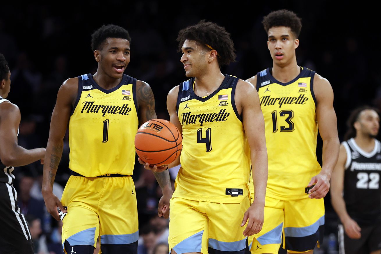
By now, I feel like everyone’s pretty familiar with the uniforms that Marquette men’s basketball has been wearing since the 2020-21 season. Specifically, I’m talking about the font that the word “Marquette” is in on the front of the jerseys. Here’s a picture of David Joplin in the NCAA tournament this year that makes it nice and easy to see.
Photo by Mitchell Layton/Getty Images
If you’ve been paying attention to the team via social media, you’ve noticed that the athletic department has been using a similar font on some of the men’s basketball posts. I say similar because it is not exactly the same font. Please note the size and shape of the space in the lower case e’s. The uniform has a four sided space, the social media has a three sided space.
So it’s not exactly the same, and there’s presumably some sort of “Nike got the rights to the font for the uniforms but the university doesn’t have the rights for general every day use for some legal/financial reasons” explanation. That’s fine, I don’t care. It’s close, and that’s fine……
……. most of the time.
When the font gets used for Tyler Kolek’s name on that Preseason Big East Player of the Year post, no problem. It’s close enough to the uniform font that I don’t care and, more importantly, the letters look like the letters that they are supposed to be.
I want to bring in this David Joplin Preseason Erving Award Watchlist post to make a point here, specifically what the J in Joplin looks like.
Here’s the post from when Tyler Kolek made the Cousy Award Midseason Top 10. Please look at the T in Top and scroll back up to the J in Joplin, and then come on back down here.
They’re way too close to each other, mostly because the loop on the bottom. The difference is the bar on the top of the letter extends all the way across on the T and stops on the J. However, it’s not weird to see a printed capital J with a full bar on the top, so when you see the T with it, it sure looks like a J, doesn’t it?
Case in point: Is this a Ticket Tracker or a Jicket Jracker?
Best case scenario: Now that I’ve pointed out to you, you can’t unsee it, right?
If the problem was “hey, this extra loop on the G is whacky,” then I think we could all just get along with it and say “that’s silly, but it’s the only problem, such is life.”
But it’s not, and the J/T thing isn’t the only problem, either.
On February 3rd, it was Director of Program Development Tyler McDevitt’s birthday, and of course there was a post for that…. and this is the first Happy Birthday post that uses the font. It used to be a different one, as recently as Stevie Mitchell’s birthday on January 29th.
And so we now, at a glance, ask ourselves what a Rirthday is.
Because the bottom of the B isn’t closed off like it’s supposed to be, it looks like an R instead. Here’s the Round of 32 pregame post from this year’s NCAA tournament. You can see what the R looks like in this font, and, yep, the B and the R are just a liiiiiiiiiiiiiitle too close.
I want to be clear: Most of the time the font is fine. Maybe a little goofy like when Tyler Kolek broke the single game assists record, because it’s kind of an over the top font and seeing a lower case s that many times in one word is maybe a little jarring, but it’s mostly speaking fine most of the time. It’s just that when it’s bad, it’s really bad……. but even then, it’s mostly fine.
Since it’s mostly fine almost all of the time, I want to be clear about this: I am 100% aware that this is a ridiculous complaint. I know exactly how silly pointing all of this out is.
HOWEVER.
In the wake of the NFL Draft, Los Angeles Rams head coach Sean McVay was talking about defensive tackle Kobie Turner wanting to reach out to all of the new draft picks, and he mentioned Marquette head coach Shaka Smart’s viewpoints on culture along the way.
“We want to be able to have an atmosphere and an environment where people can authentically be themselves, but also try to guide them in terms of the values and the principles that we feel like are in alignment,” McVay said. “And how you reflect humility, how you reflect an energy and accountability, how you build relationships, how you reflect a mental toughness, there are some consistent things, but it’s unique to each person’s personality. And I’ve heard [Marquette men’s basketball coach] Shaka Smart talk about culture, how we act, interact, and respond in all that we do. And I want guys to do that authentically with themselves, but also you want to make sure that you’re praising the types of things that we feel like are in alignment with that atmosphere. And Kobie does so many of those things naturally.
McVay has had quite the run of success as Rams head coach since being hired in 2017, including winning Super Bowl LVI following the 2021 season. It makes all the sense in the world for Marquette men’s basketball to promote McVay bringing up Smart’s coaching foundations out of the blue………
…… and for whatever reason, someone decided to use the font on every single word in the post.
Turns out we found two new and very real problems with the font: It’s absolutely awful when used for a big block of text and it’s absolutely awful when said big block of text is small.
This is too much. This is over the line. This is uncalled for. This is straight up counterproductive. I was willing to go with the flow on the slightly silly things like the J and the T looking too much alike. This is actively bad. For a comparison, look at what the women’s basketball team did for a post with a quote from Iowa Hawkeyes head coach Lisa Bluder praising MU hiring former Iowa point guard Cara Consuegra as the new head coach in Milwaukee:
See! Isn’t that much nicer and easier to read?
I get that we’re going to keep seeing the jersey font as long as Marquette continues to wear those jerseys. It makes branding sense, even if they’re not actually the literal exact same font. It’s (mostly and usually) fine.
But can we just not use it like in the McVay post ever again? Just keep it to two or three words at a time, all in a big size so it’s easy to read? Am I asking too much here?